
Use CSS's aspect-ratio property (or an intrinsic-ratio box for older browsers) to make an iframe responsive. Add JavaScript only when content height changes dynamically or the embedded page is cross-origin.
The fastest working solution:
iframe {
  width: 100%;
  aspect-ratio: 16 / 9;
  height: auto;
  display: block;
}
<iframe
  src="https://example.com/embed"
  title="Embedded content"
  loading="lazy"
  allowfullscreen>
</iframe>
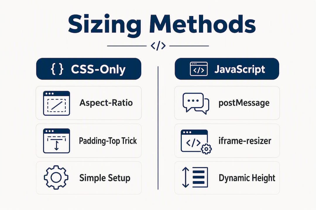
This covers the majority of fixed-aspect embeds: video players, game previews, and document viewers. When it is not enough:
- Static fixed-aspect content (YouTube, Vimeo, game intros):
aspect-ratioCSS alone is sufficient. - Dynamic-height content (leaderboards, interactive apps, forms): the iframe's height changes after load, so CSS cannot track it. You need
postMessageor a library like iframe-resizer. - Cross-origin dynamic content: the embedded page must opt in to height reporting. CSS-only approaches will not work.
Pro Tip: Set display: block on the iframe. Inline elements get a small gap below them from the line-height baseline, which creates a phantom whitespace strip under the embed.
The cleanest responsive iframe in 2026 is two CSS rules:
width: 100%andaspect-ratio: 16 / 9. Everything else is a fallback or an edge case.
Table of Contents
- How does the CSS aspect-ratio property work for responsive iframes?
- The padding-top trick: a CSS-only fallback that still works everywhere
- Copy-paste embed examples for YouTube, Vimeo, and document viewers
- Dynamic height and cross-origin sizing: which approach fits your situation?
- Accessibility, security, and performance: the attributes that actually matter
- Troubleshooting scrollbars, layout jank, and cross-origin sizing failures
- Embedding a Megasports-arena game responsively: a practical example
- Key Takeaways
- The case for keeping iframes simple
- Embed Megasports-arena games on your site and keep visitors playing
- Useful sources for implementation and testing
How does the CSS aspect-ratio property work for responsive iframes?
The aspect-ratio property lets you apply a fixed width-to-height ratio directly to an iframe element, no wrapper div required. The browser calculates the height automatically as the iframe scales with its container.

/* Modern approach — apply directly to the iframe */
iframe.responsive {
  width: 100%;
  height: auto;
  aspect-ratio: 16 / 9;
  display: block;
  border: none;
}
<iframe
  class="responsive"
  src="https://example.com/embed"
  title="Descriptive title for screen readers"
  loading="lazy"
  allowfullscreen>
</iframe>
You can swap 16 / 9 for any ratio: 4 / 3, 1 / 1, or 21 / 9 for ultra-wide players. The syntax accepts integers or decimals.
Browser support
| Browser | aspect-ratio support | Notes |
|---|---|---|
| Chrome | Yes | Full support |
| Firefox | Yes | Full support |
| Safari | Yes | Full support |
| Edge | Yes | Full support |
Broad support across modern browsers means aspect-ratio is safe to use as your primary method today. The only case for a fallback is when you need to support browsers released before 2021, or when you are generating embed code for email clients (which largely ignore CSS).
- Use
aspect-ratioas the default for all new projects. - Add the padding-top intrinsic-ratio box as a
@supports notfallback only when your analytics show significant traffic from older browsers. - Never rely on
aspect-ratiofor dynamic-height content regardless of browser version.
Pro Tip: Use @supports (aspect-ratio: 1) to conditionally apply the modern rule and let older browsers fall through to the padding-top fallback. This keeps your CSS clean without a preprocessor.
Applying
aspect-ratiodirectly to the<iframe>element, rather than a wrapper, is the correct modern pattern. Wrapper divs were a workaround for a CSS gap that no longer exists in current browsers.
The padding-top trick: a CSS-only fallback that still works everywhere
When you cannot rely on aspect-ratio — older browser targets, email clients, or CMS environments with locked CSS — the intrinsic-ratio box is your next best option. It uses the fact that padding-bottom (or padding-top) expressed as a percentage is calculated relative to the element's width, not its height.
How to calculate the padding value
Divide the height by the width, then multiply by 100:
- 16:9 → (9 ÷ 16) × 100 =
56.25% - 4:3 → (3 ÷ 4) × 100 =
75% - 1:1 → (1 ÷ 1) × 100 =
100%
Full HTML and CSS example
.iframe-container {
  position: relative;
  width: 100%;
  padding-bottom: 56.25%; /* 16:9 */
  height: 0;
  overflow: hidden;
}

.iframe-container iframe {
  position: absolute;
  top: 0;
  left: 0;
  width: 100%;
  height: 100%;
  border: none;
}
<div class="iframe-container">
  <iframe
    src="https://example.com/embed"
    title="Embedded content"
    loading="lazy"
    allowfullscreen>
  </iframe>
</div>
W3Schools documents this pattern as the standard CSS-only fallback. If you are already on Bootstrap, the .ratio utility class (formerly .embed-responsive) does the same thing with built-in modifier classes for 16x9, 4x3, and 1x1 ratios.
Common pitfalls
- Inline
widthandheightattributes on the<iframe>tag: these override your CSS. Remove them or they will fight your layout. - Forgetting
height: 0on the container: without it, the container collapses and the padding does nothing. overflow: hiddenmissing: the absolutely positioned iframe will bleed outside the container on some browsers.- Box-sizing conflicts: if a parent applies
box-sizing: border-box, verify the padding calculation still resolves correctly.
Pro Tip: Build a utility class (.ratio-16x9, .ratio-4x3) and reuse it across your project. Maintaining one place for the padding value is far easier than hunting down hardcoded percentages across templates.
When to prefer this legacy method: you are generating embed code for email newsletters, targeting a CMS that strips @supports queries, or your user-agent analytics show a meaningful share of pre-2021 browser versions.
Copy-paste embed examples for YouTube, Vimeo, and document viewers
YouTube
<!-- Modern: aspect-ratio -->
<iframe
  class="responsive"
  src="https://www.youtube.com/embed/VIDEO_ID"
  title="Video title — always describe the content"
  loading="lazy"
  allow="accelerometer; autoplay; clipboard-write; encrypted-media; gyroscope; picture-in-picture"
  allowfullscreen
  referrerpolicy="strict-origin-when-cross-origin">
</iframe>

<!-- Fallback: intrinsic-ratio container -->
<div class="iframe-container">
  <iframe
    src="https://www.youtube.com/embed/VIDEO_ID"
    title="Video title"
    loading="lazy"
    allowfullscreen
    referrerpolicy="strict-origin-when-cross-origin">
  </iframe>
</div>
Vimeo
<div class="iframe-container">
  <iframe
    src="https://player.vimeo.com/video/VIDEO_ID"
    title="Vimeo video title"
    loading="lazy"
    allow="autoplay; fullscreen; picture-in-picture"
    allowfullscreen
    referrerpolicy="strict-origin-when-cross-origin">
  </iframe>
</div>
Recommended attributes at a glance
| Attribute | Purpose | Required? |
|---|---|---|
title | Screen reader label | Always |
loading="lazy" | Defers offscreen load | Strongly recommended |
allowfullscreen | Enables fullscreen for video | Video embeds |
referrerpolicy | Controls referrer header | Third-party embeds |
allow | Scopes browser feature access | When features are needed |
sandbox | Restricts iframe capabilities | Untrusted content |
IBM Video Streaming's embed documentation confirms that title and loading=lazy are the two most commonly omitted attributes in manual implementations.
For interactive apps versus video players, the key difference is allow. Video players need autoplay and picture-in-picture; interactive games need allow="fullscreen" and sometimes allow="pointer-lock" for mouse-capture features. Avoid granting camera or microphone unless the embed genuinely requires them.
Pro Tip: Tools like Iframely generate embed code with the correct allow and sandbox values pre-filled. Paste the output, then add your responsive CSS wrapper. It saves the attribute-hunting step for unfamiliar providers.
A missing
titleattribute is the single most common accessibility failure in iframe embeds. Screen readers announce "frame" with no context, leaving keyboard-only users stranded.
Dynamic height and cross-origin sizing: which approach fits your situation?
CSS fixes the aspect ratio. It cannot read the embedded page's DOM. When content height changes after load — a leaderboard that updates, a form that expands, an interactive game — you need a communication channel between the two documents.

Same-origin vs. cross-origin
Same-origin iframes (same protocol, domain, and port) let the parent page access contentDocument directly and read scrollHeight. Cross-origin iframes block that access entirely. The embedded page must explicitly send its height to the parent via postMessage.
postMessage: a custom handshake
// In the embedded page (child)
window.parent.postMessage(
  { type: 'resize', height: document.body.scrollHeight },
  'https://your-parent-domain.com'
);

// In the parent page
window.addEventListener('message', (event) => {
  if (event.origin !== 'https://your-embedded-domain.com') return;
  if (event.data.type === 'resize') {
    document.querySelector('iframe').style.height = event.data.height + 'px';
  }
});
Always validate event.origin. An open listener that accepts any origin is a security hole.
iframe-resizer: the library approach
// Parent page — after including the library script
iFrameResize({ log: false, checkOrigin: true }, '#my-iframe');
The embedded page needs one small script tag from the iframe-resizer package. The library then monitors DOM changes and updates the parent iframe height in near real time, handling edge cases like images loading after the initial render.
Comparison of sizing methods
| Method | Cross-origin | Complexity | Reliability | Performance impact |
|---|---|---|---|---|
| CSS-only (aspect-ratio) | N/A | Low | High for fixed-aspect | Negligible |
| postMessage (custom) | Yes | Medium | Medium (manual edge cases) | Low |
| iframe-resizer | Yes | Low-medium | High | Low (MutationObserver) |
| Scaling iframe (CSS transform) | N/A | Low | Low (blurry on small screens) | Low |
The W3C CSS Working Group has also proposed a native responsive-sizing model that requires a double opt-in: a responsive-embedded-sizing meta tag in the embedded document and a frame-sizing property in the parent. It is still a draft, not production-ready.
Pro Tip: Prefer iframe-resizer over a hand-rolled postMessage implementation for any production embed. The library handles resize observers, image-load delays, and cross-browser quirks that a custom solution almost always misses on the first pass.
The security rule for postMessage is simple: always check
event.originbefore acting on a message. Skipping that check turns your resize listener into an open injection point.
Accessibility, security, and performance: the attributes that actually matter
Accessibility
Every iframe needs a descriptive title attribute. "Frame" tells a screen reader nothing; "MegaSports Baseball Shootout game" tells them everything. Beyond the title:
- Keep keyboard focus logical. If the iframe contains interactive content, test Tab navigation to confirm focus enters and exits the frame predictably.
- Never use
aria-hidden="true"on an iframe that contains meaningful content. It removes the element from the accessibility tree entirely. - For decorative or purely presentational iframes,
aria-hidden="true"is appropriate.
Security
The sandbox attribute is your first line of defense for third-party content. An empty sandbox blocks scripts, forms, popups, and same-origin access. Add back only what you need:
<iframe
  sandbox="allow-scripts allow-same-origin allow-forms"
  src="https://third-party.com/widget"
  title="Widget description">
</iframe>
Set referrerpolicy="strict-origin-when-cross-origin" for any cross-origin embed. It prevents the full URL (which may contain user data) from leaking in the Referer header.
Performance
loading="lazy" defers iframe loading until the element is near the viewport. For pages with multiple embeds below the fold, this meaningfully reduces initial page weight. For more control, use IntersectionObserver to load the iframe src only when the container enters the viewport:
const observer = new IntersectionObserver((entries) => {
  entries.forEach(entry => {
    if (entry.isIntersecting) {
      const iframe = entry.target;
      iframe.src = iframe.dataset.src;
      observer.unobserve(iframe);
    }
  });
});
document.querySelectorAll('iframe[data-src]').forEach(el => observer.observe(el));
Store the real URL in data-src and leave src empty until the observer fires.
Pro Tip: Combine sandbox="allow-scripts" with a tightly scoped postMessage API. The iframe can still communicate its height to the parent without needing allow-same-origin, which would otherwise let the embedded script escape the sandbox.
Troubleshooting scrollbars, layout jank, and cross-origin sizing failures
Most responsive iframe problems fall into a short list of root causes.
Quick debug checklist (run in DevTools)
- Open the Elements panel and inspect the iframe's computed styles. Check that
widthresolves to the container width andheightis not a hardcoded pixel value. - Check computed
padding-bottomon the wrapper div. If it shows0px, the intrinsic-ratio container is broken. - In the Network panel, confirm the iframe
srcis not blocked by aContent-Security-PolicyorX-Frame-Options: DENYheader on the embedded page. - Switch to a mobile viewport in DevTools (Toggle device toolbar) and look for horizontal scroll or overflow.
- Check the Console for
postMessageerrors or cross-origin security warnings.
Targeted fixes
- Scrollbars appearing inside the iframe: the embedded page's content is wider than the iframe. Add
scrolling="no"(deprecated but still functional) or setoverflow: hiddenon the embedded page'sbody. Better: fix the embedded page's layout. - Unexpected whitespace below the iframe: the iframe is an inline element by default. Set
display: blockon it. - Layout jank on load: user-agent stylesheets historically set a minimum iframe height; override it explicitly with
min-height: 0. - Hardcoded pixel height in the markup: remove the
heightattribute from the<iframe>tag. It overrides CSS height declarations. - Cross-origin iframe not resizing: confirm the embedded page includes the iframe-resizer child script, or that your
postMessagelistener validates the correct origin and the child is actually sending messages.
Pro Tip: In DevTools, right-click the iframe element and choose "Reveal in Elements panel" after clicking inside the frame. This lets you inspect the embedded document's DOM directly for same-origin iframes, which is the fastest way to diagnose overflow and height issues.
Embedding a Megasports-arena game responsively: a practical example
Megasports-arena games like Baseball Shootout are interactive, fixed-aspect applications. The aspect-ratio approach works well for the game canvas itself. For dynamic elements like leaderboards, you will want a JS fallback.
Copy-paste embed for a Megasports-arena game
<!-- Modern CSS approach -->
<style>
  .mga-embed {
    width: 100%;
    aspect-ratio: 16 / 9;
    height: auto;
    display: block;
    border: none;
    border-radius: 8px;
  }
</style>

<iframe
  class="mga-embed"
  src="https://megasports-arena.com/games/baseball-shoot-out"
  title="MegaSports Baseball Shootout — free fantasy sports game"
  loading="lazy"
  allow="fullscreen; pointer-lock"
  sandbox="allow-scripts allow-same-origin allow-forms allow-popups"
  referrerpolicy="strict-origin-when-cross-origin">
</iframe>
For the leaderboard page, which updates dynamically, add iframe-resizer to handle height changes after the initial render.
Integration tips for partner sites
- Use
sandbox="allow-scripts allow-same-origin allow-forms allow-popups"to permit game interaction while blocking untrusted resource loads. - Add
allow="fullscreen"so players can expand the game view on supported browsers. - Set
loading="lazy"on any game embed placed below the fold. Games are asset-heavy; deferred loading keeps your page's initial load fast. - For analytics, listen for
postMessageevents from the game frame to track engagement milestones without needing direct DOM access. - Test at 375px viewport width (iPhone SE) and 768px (iPad). Games with fixed minimum widths will scroll horizontally if the container is too narrow.
Partner sites that embed Megasports-arena games with proper responsive CSS and lazy loading report consistently better engagement, because players get a clean, full-width game view on every device rather than a clipped or scrolling frame.
Pro Tip: Link your embed to the how-to-play page alongside the game frame. Players who understand the rules before they start are more likely to complete a session, which directly improves your embedded content's engagement metrics.
Key Takeaways
The most reliable responsive iframe in 2026 uses aspect-ratio: 16 / 9 with width: 100% as the default, the padding-top intrinsic-ratio box as a CSS-only fallback, and JavaScript only when content height is dynamic or cross-origin.
| Point | Details |
|---|---|
| Use aspect-ratio first | Apply aspect-ratio: 16 / 9 and width: 100% directly to the iframe for all fixed-aspect embeds. |
| Fallback with padding-top | Use padding-bottom: 56.25% on a relative container for older browsers and email clients. |
| Add JS for dynamic height | Use iframe-resizer or a validated postMessage handshake when content height changes after load. |
| Always include title and sandbox | A descriptive title is required for accessibility; sandbox limits attack surface for third-party content. |
| Megasports-arena embeds | Use aspect-ratio CSS for game canvases; add iframe-resizer for leaderboard pages with dynamic content. |
The case for keeping iframes simple
The conventional wisdom in developer circles is that iframes are a legacy hack you should avoid. That framing is wrong, or at least imprecise. iFrames remain the correct tool for cross-domain content isolation. The real problem is not iframes themselves but the habit of reaching for JavaScript complexity before exhausting CSS options.
My three working rules: start with aspect-ratio and nothing else. Add the padding-top fallback only when your browser-support data justifies it. Reach for iframe-resizer only when you have confirmed that the content height genuinely changes after load and that CSS cannot solve it. Most embeds never need the third step.
The one case where I would skip iframes entirely: when you control both the parent and the embedded content and they share the same origin. In that situation, a server-side include, a web component, or a simple <script> widget gives you full DOM access, better performance, and no cross-origin headaches. iFrames earn their complexity cost when isolation is the actual requirement.
Embed Megasports-arena games on your site and keep visitors playing
Sports fans who land on your site and find an embedded Megasports-arena game stay longer and come back more often. The platform offers free fantasy sports games across MLB, NBA, NFL, NHL, and more, including prediction contests, trivia, leaderboards, and puzzle games — all embeddable with a single iframe tag.

The embed setup takes minutes using the CSS techniques in this article. Point the iframe src at any Megasports-arena game URL, apply aspect-ratio: 16 / 9 and width: 100%, and your visitors get a full-width, device-adaptive game experience with no additional configuration. For partner sites that want step-by-step guidance, the Sports Rummy how-to-play page walks through game mechanics and embed parameters. Start with one game, measure session time, and expand from there.
Useful sources for implementation and testing
The sources below cover the full implementation stack, from CSS specs to library docs to testing tools.
| Source | What you will find |
|---|---|
| CSS-Tricks: Responsive Iframes | Practical CSS techniques, intrinsic ratio explanation, and browser behavior notes |
| W3Schools: Responsive Iframes | Copy-paste padding-bottom examples for common ratios |
| iframe-resizer (GitHub) | Library source, setup docs, and cross-origin configuration |
| iframe-resizer (official site) | Full API reference and advanced configuration options |
| W3C CSSWG: Responsive iframes explainer | Draft spec for native cross-origin responsive sizing |
| Bootstrap Embeds | Pre-built ratio utility classes for Bootstrap projects |
| Iframely | Embed code generator with correct attributes pre-filled |
| IBM Video Streaming: Responsive Embed | Attribute reference and video-specific embed guidance |
For testing, use Chrome DevTools' device toolbar to simulate common viewport widths (375px, 768px, 1280px). For cross-browser verification, BrowserStack and LambdaTest let you run live tests on real devices without owning the hardware. The Stack Overflow thread on making an iframe responsive is also worth bookmarking for community-sourced edge cases and browser-specific workarounds.
The best testing workflow is three steps: DevTools at 375px to catch mobile overflow, a real iOS device for Safari rendering, and a quick pass through the Network panel to confirm lazy-loaded iframes are not blocking the initial page render.