
Interactive content analytics is the practice of measuring how people actually engage with quizzes, polls, calculators, video, and games, using event-level data instead of simple pageviews. The single most useful first step is instrumenting every interaction, from a quiz start to a final answer, so you can see completions and drop-off rather than guessing from surface traffic. Active engagement signals like completion rate and answers per session tell you more than reach ever will.
Table of Contents
- What Interactive Content Analytics Actually Measure
- Which Metrics Actually Predict Results
- Where the Data Comes From: Platforms, GA4, and Behavior Tools
- A Practical Tag and Data Plan for Interactive Content
- Turning Engagement Data Into Experiments
- Practitioner Notes From Megasports Arena on Measuring Embeds and Contests
- Common Challenges and Pitfalls in Interactive Content Analytics
- Case Studies Showing Successful Use of Interactive Content Analytics
- Methods for Segmenting Audiences Based on Interaction Data
- Why Treating Content as a Product Changes What You Measure
- Megasports Arena: Embeddable Games Built for Participation Data
- Sources
- FAQ
What Interactive Content Analytics Actually Measure
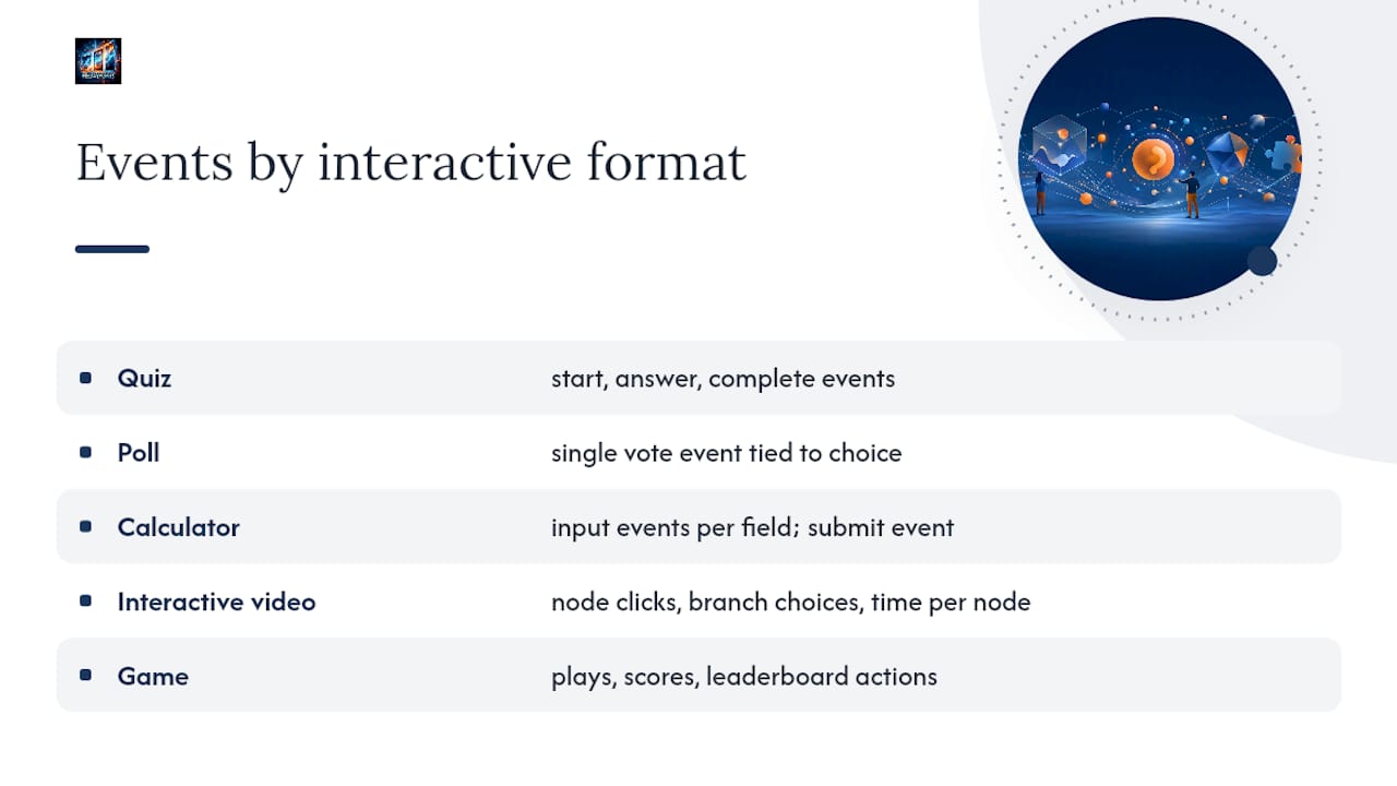
Every interactive format throws off a different set of events, and knowing which ones matter changes what you build into your tracking plan from day one. A quiz generates a start event when someone clicks in, an answer event for each question, and a complete event when they hit the results screen. Polls are simpler: a single vote event tied to a choice. Calculators produce input events for each field and a submit event when someone requests a result. Interactive video is the richest format, capturing node clicks, branch choices, and time spent per node, while games log plays, scores, and leaderboard actions.
The distinction that matters most here is passive versus active engagement. A pageview or a video autoplay is passive. It tells you someone was present, not that they did anything. An answer submitted, a branch chosen, a score posted to a leaderboard: those are active signals, and they correlate far more tightly with actual interest than raw traffic does. Genially's activity dashboards illustrate this well. They report visits and interactions separately, break results down by individual question, and let you export the whole session set as a CSV for further analysis. That per-question view is what lets you spot the exact moment a quiz loses people, rather than just knowing that some fraction of visitors bounced.
Interactive video works similarly at a more granular level. Platforms built around branching video track which choices viewers make at each decision point, how long they linger on a given node before moving on, and where retention falls off inside a branch. Stornaway's analytics documentation shows this kind of per-node retention data paired with downloadable session CSVs, which is exactly the format you want if you're trying to figure out whether a branch is confusing people or simply isn't interesting. Video platforms built for broader use, like Brightcove's interactivity reporting, expose similar experience-level metrics: play rate, interaction rate, total view time, and user activity streams that let you follow a single viewer's path through an experience.
Games sit closer to the calculator model but with more layers. A leaderboard action, a repeat play, a shared score: each is a distinct event, and each tells a different story about whether the game is a one-time novelty or something people come back to.
Which Metrics Actually Predict Results
Group your metrics into five buckets: reach, attention, interaction, conversion, and retention. Reach is how many people saw the asset. Attention is how long they stayed or how far they scrolled. Interaction is what they actually did inside the experience. Conversion is whether that action led to a business outcome. Retention is whether they came back.
Most teams over-index on reach because it's the easiest number to pull, but reach tells you almost nothing about whether the content worked. The metrics worth building a dashboard around look more like this:
- Starts and completions — how many people began the experience versus finished it, which exposes drop-off immediately.
- Interaction rate — the share of visitors who took any active action, not just viewed the page.
- Time on node or module — useful for interactive video and multi-step calculators to find where attention dies.
- Answers per session — for quizzes and assessments, a proxy for depth of engagement.
- Share or forward rate — a strong active signal, since sharing requires effort a passive viewer won't make.
- CTA conversion rate — the percentage who clicked through to a next step after finishing.
- Recirculation or return visits — whether the content brought people back to your site later.
Which of these to prioritize depends on the goal. For awareness campaigns, interaction rate and share rate matter most, since the point is spreading reach through genuine interest rather than paid amplification. For lead generation, CTA conversion rate is the number that justifies the budget. For sales enablement content, tracked links and per-recipient analytics matter more than aggregate metrics, because a proposal shared one-to-one needs to show who opened it and for how long, not just how many total views it got. For learning content, completion rate and answers per session are the closest things to a proxy for whether the material actually landed.
The pattern across all four cases is the same: active signals like completions, answers, and shares predict downstream outcomes far better than passive reach does. A quiz with ten thousand views and a 20% completion rate is weaker than one with a thousand views and 80% completion, because the second one is actually doing its job for the people who engage with it.
Where the Data Comes From: Platforms, GA4, and Behavior Tools
No single tool gives you the full picture, so most measurement setups blend at least three data sources.
Platform-built analytics are the fastest starting point. Tools like Genially, Riddle, and Kaltura's interactive layer report starts, completions, per-question results, and node-level retention right out of the box, often with a CSV export for anyone who wants to run their own analysis. Genially specifically supports SCORM and LTI exports, which matters if any of your interactive content lives inside a learning management system and needs to report completion data back to that system.
GA4 fills the attribution gap platform dashboards can't cover. It won't tell you which quiz question someone struggled with, but it will tell you which channel brought them to the quiz and what they did after leaving it, which is essential for tying interactive content to a broader funnel.
Behavior analytics tools add a layer neither of the above captures well. Mouseflow's approach to content engagement combines scroll depth, heatmaps, and friction scoring with event data, which is how you catch a poll that's technically working but sitting below the fold where nobody scrolls to it.
A few other categories round out the stack:
- Dashboarding and ETL tools like Klipfolio or Looker Studio pull data from platform exports, GA4, and behavior tools into one unified view, which matters once you're running more than a handful of interactive assets at once.
- Paperflite and similar content platforms track individual recipients on sales-shared assets, filling the gap standard web analytics leave for one-to-one content.
- CDPs become necessary once you need to tie interaction data to a known contact record rather than an anonymous session, especially for gated calculators or lead-gen quizzes.
A Practical Tag and Data Plan for Interactive Content
Start with the business question, not the tool. If the question is "does this quiz drive signups," your event plan needs a path from quiz_start to quiz_complete to cta_click to an actual conversion event on your signup page. If the question is "which video branch keeps people watching longest," you need node_view and time_on_node events tied to a consistent node ID scheme.
A workable event naming convention looks like this in practice: start, complete, question_answered, choice_made, cta_click, share, and time_on_node. Keep these consistent across every asset so comparisons hold up later. A quiz launched in March and one launched in October should use the exact same event names if you ever want to compare them side by side.
Here's a rollout sequence that works for most teams:
- Map each business question to the specific events that answer it before building anything.
- Tag every embedded asset with a content ID and pass UTM parameters through so campaign context survives the embed.
- Test event payloads in staging, confirming that each event fires with the right parameters attached.
- Verify the CSV export matches what your dashboard shows, since a mismatch here usually means a tagging error, not a platform bug.
- Document consent requirements up front, capturing only first-party or zero-party data you have permission to collect, and confirm your export process can anonymize session data when needed.
Pro Tip: Build your event naming convention in a shared doc before you launch a single asset. The five minutes it takes to agree on cta_click versus click_cta saves weeks of cleanup once you're running comparisons across a dozen campaigns.
Turning Engagement Data Into Experiments
Drop-off patterns are the fastest way to find friction. If completion falls sharply between question three and four in a quiz, that's not a coincidence, it's a specific question that's too long, too confusing, or poorly ordered. The same logic applies to interactive video: a steep viewer loss at a particular node usually points to a branch that's either boring or badly explained.
Once you've found the friction point, run a single-variable test against it. Shorten the flow by cutting one question. Reorder so the easiest question comes first, since early momentum tends to carry people through harder questions later. Swap the CTA copy on the results screen. Test one change at a time so you know which one actually moved the number.
Treating content like a product means setting a benchmark before you launch rather than after. Compare completion rate and interaction rate against your own past assets in the same format and channel, not against generic industry averages that won't reflect your audience. Cohort comparisons, this quarter's quiz players against last quarter's, are more useful than any external benchmark could be.
Reporting cadence should shift depending on where the asset is in its life. In the first two weeks after launch, check daily for tagging errors and early drop-off signals. After that, weekly reporting is usually enough, with a monthly rollup that feeds into planning for the next asset.
Practitioner Notes From Megasports Arena on Measuring Embeds and Contests
Publishers running embedded interactive games should watch four numbers closely: starts, plays, leaderboard interactions, and repeat participation. Repeat participation is the one that separates a novelty from a genuine retention driver, since a fan who plays once is a data point, but a fan who comes back for a second contest week is a signal worth building a strategy around.
When embedding, pass campaign context and a content ID with every placement so exports can be tied back to the specific page or partner site running the widget. Set an export cadence, weekly at minimum during an active contest window, so participation data feeds into your broader content reporting rather than sitting isolated in a separate dashboard.
Common Challenges and Pitfalls in Interactive Content Analytics
The most common mistake is tracking completions without tracking starts, which makes it impossible to calculate a real completion rate. A raw completion count means nothing without knowing how many people began the experience in the first place.
Inconsistent event naming across campaigns is the second big one. If one quiz fires quiz_complete and another fires finish_quiz, your dashboard can't compare them without manual cleanup, and that cleanup rarely happens consistently enough to trust.
Attribution gaps trip up more teams than they expect. An interactive asset embedded on a partner site often loses its UTM context the moment it's shared further, which is exactly why sales-shared content needs tracked links and per-recipient analytics instead of relying on generic pageview counts.
Vanity metrics are the quiet killer. A quiz that goes viral on shares but converts nobody looks like a win in a weekly report and a failure in a quarterly revenue review. Watch for teams reporting reach numbers without pairing them against at least one active engagement or conversion metric.
Finally, sampling and export limits catch people off guard. Some platform dashboards cap how much historical data you can pull through the interface, which is why regular CSV exports matter even when you don't need the data immediately.
Case Studies Showing Successful Use of Interactive Content Analytics
Publisher-focused measurement guides consistently point to the same pattern: sites that pair pageviews with engaged sessions, average engagement time, recirculation rate, and a conversion signal tied to their revenue model outperform sites that report on traffic alone. Recirculation, whether a reader clicks through to another piece of content after finishing the first, is a particularly strong indicator for publishers because it ties directly to ad revenue and session depth rather than a single-page bounce.
Interactive video providers report similar results when publishers move from raw view counts to node-level retention analysis. A branch that looks fine on total views can reveal a steep, specific drop-off once you isolate per-node retention data, and fixing that single branch often lifts overall completion more than any change to the video's opening.
The common thread across these cases isn't a specific tool. It's the shift from measuring exposure to measuring action, then using that action data to make one targeted change at a time rather than rebuilding the whole asset from scratch.
Methods for Segmenting Audiences Based on Interaction Data
Interaction depth is the simplest and often most useful segment. Split your audience into people who started but didn't finish, people who completed once, and people who've completed multiple assets, then compare what content each group responds to next.
Choice patterns work well for branching content and quizzes. Two people who both complete a quiz but choose opposite answers at every branch point are different audiences, even if your aggregate completion metric treats them as identical.
Channel and device combined with interaction rate reveals a lot that channel data alone misses. A quiz might get plenty of traffic from social but a lower interaction rate there than from email, which tells you the social audience is browsing rather than engaging, and that changes how you should promote future assets on that channel.
Recency and frequency, standard segmentation tools, work just as well on interaction events as they do on purchase data. Someone who played a game three times in the last month is a fundamentally different audience than someone who played once six months ago, and treating them the same in your next campaign wastes the signal you already collected.
Why Treating Content as a Product Changes What You Measure
Most teams still measure interactive content the way they measure a static blog post: publish, wait, report. That mindset misses the point. Interactive assets behave more like products, which means the right cycle is launch, learn, and iterate, not launch and move on.
This reframes your KPIs. Instead of asking "did people see it," you're asking "did people use it, and did they come back." That shift toward engagement signals that actually resemble product-market fit changes which metrics get attention in your weekly reporting.
Organizationally, this means running single-variable experiments on a fixed cadence and sharing what you learn across every team member producing interactive content. A finding about question order from one quiz should inform the next one your team builds, not disappear into a single campaign report nobody reopens.
— Pete Korner
Megasports Arena: Embeddable Games Built for Participation Data
Embeddable games can help publishers capture first-party participation data without building a quiz or contest engine from scratch; learn about the role of interactive experiences in attractions to understand how these engagement methods drive participation. Some embeddable games come with leaderboards, contest scheduling, and export capability built in, making participation data easier to report rather than trapped in a third-party dashboard.

For sports publishers specifically, that means embedding a daily pick'em or trivia contest and immediately seeing starts, plays, and leaderboard activity feed into your own measurement stack. Repeat participation, the strongest retention signal available, becomes visible fast because contests run on a set schedule and reward returning players with points and standing. Check the betting tools page to see the embeddable widget options, or browse active contests to see what a live leaderboard-driven contest looks like on a partner site before deciding how to integrate one on yours.
Sources
FAQ
What Are Some Examples of Interactive Content?
Common examples include quizzes, polls, calculators, interactive video with branching choices, and games with leaderboards. Each format emits its own trackable events, from a quiz's start and complete actions to a calculator's input and submit events.
What Are the 12 Types of Interactive Media?
Definitions vary across sources, but a common list includes quizzes, polls and surveys, calculators, interactive infographics, branching video, assessments, interactive ebooks, configurators, contests, games, interactive maps, and shoppable content. The exact count matters less than tracking the right events for whichever formats you actually use.
What Does "Interactive Content Analytics" Mean?
It refers to measuring how people engage with interactive formats using event-level data such as starts, completions, and choices rather than relying on pageviews alone. The goal is tying active engagement signals to real outcomes like conversions or repeat visits.
Which Metrics Should I Prioritize First?
Start with starts and completions to calculate a real completion rate, then add interaction rate and, if relevant, CTA conversion rate. Active signals like completions and shares predict outcomes better than passive reach, so prioritize those over raw view counts.
Does Megasports-arena Provide Participation Data for Embedded Games?
Yes. Megasports-arena's embeddable games include leaderboards and contest scheduling, and publishers can export participation data to track starts, plays, and repeat engagement. Current pricing and embed options are listed on the Megasports-arena site.